Overview:
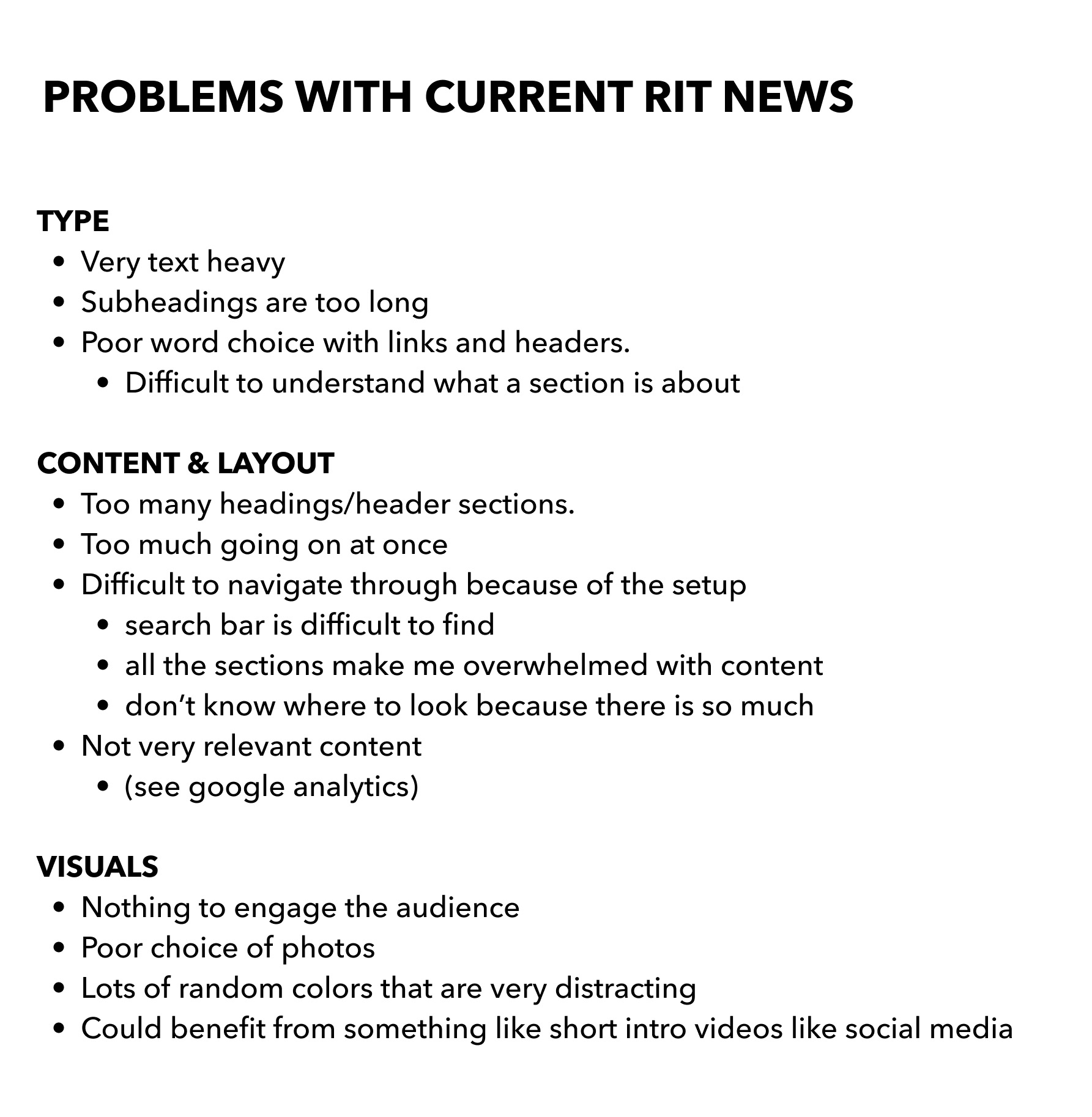
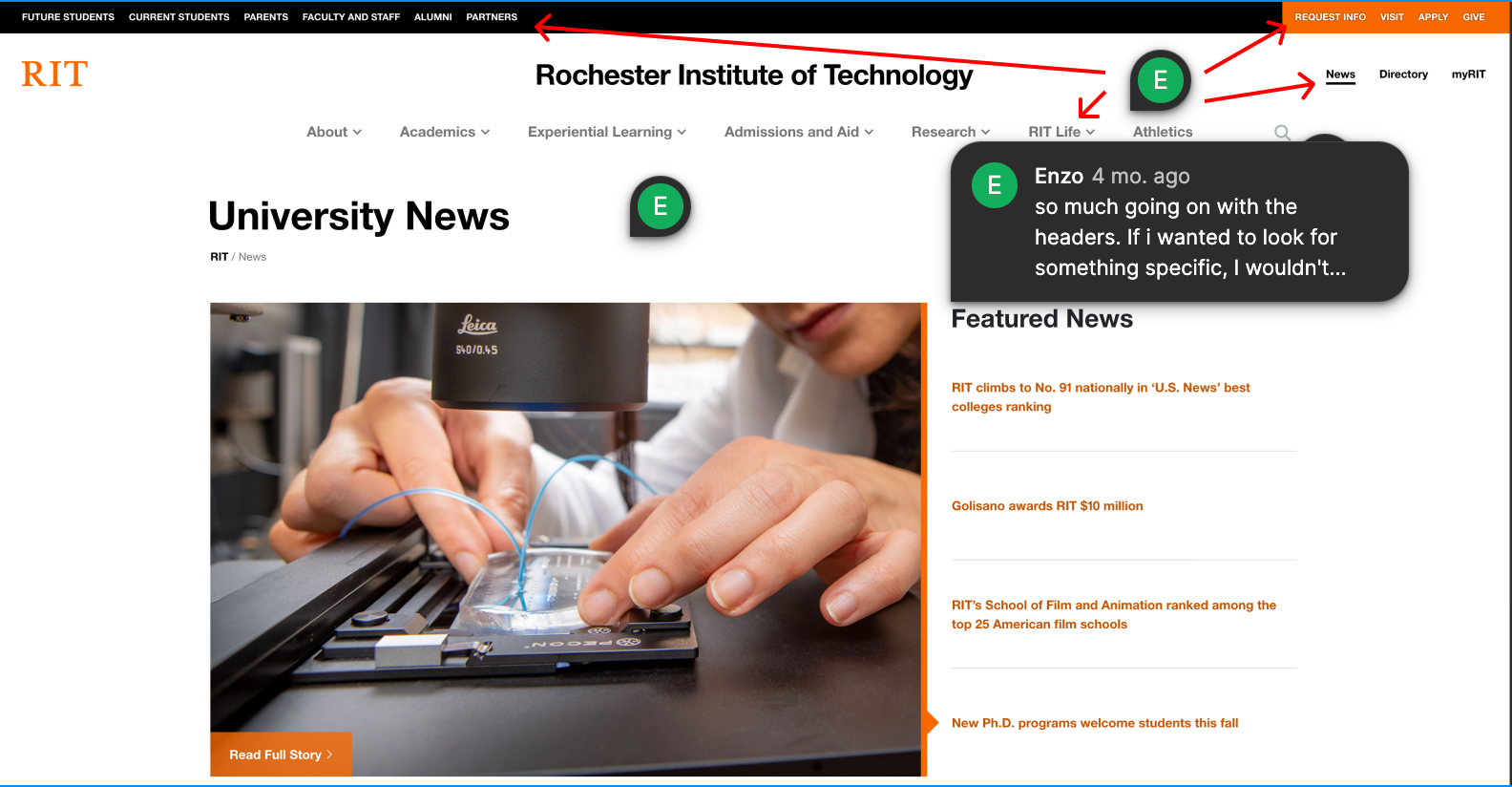
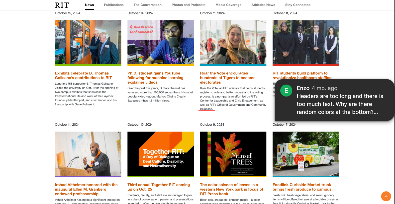
The news page website for Rochester Institute of Technology isn't the best design when it comes to efficiency and usability. It gets the job done sharing news about the school, but could definitely benefit from some changes.
This re-design of the website attempts to solve these issues by making sure to create a visually engaging website with strong visual hierarchy.
Research
User Persona
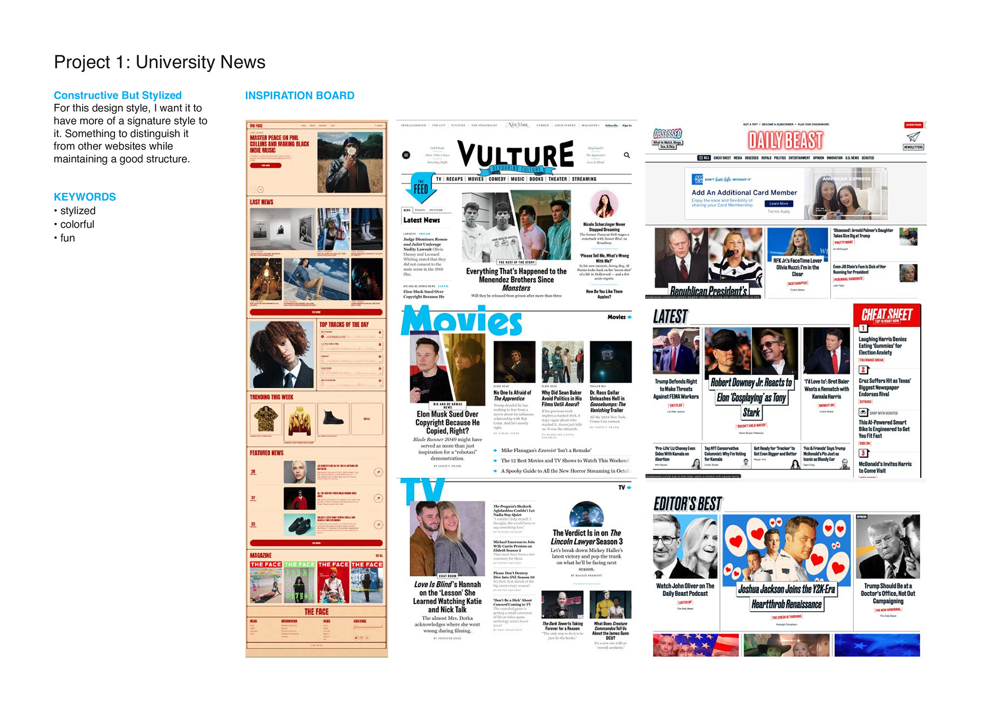
Moodboards

Sketches
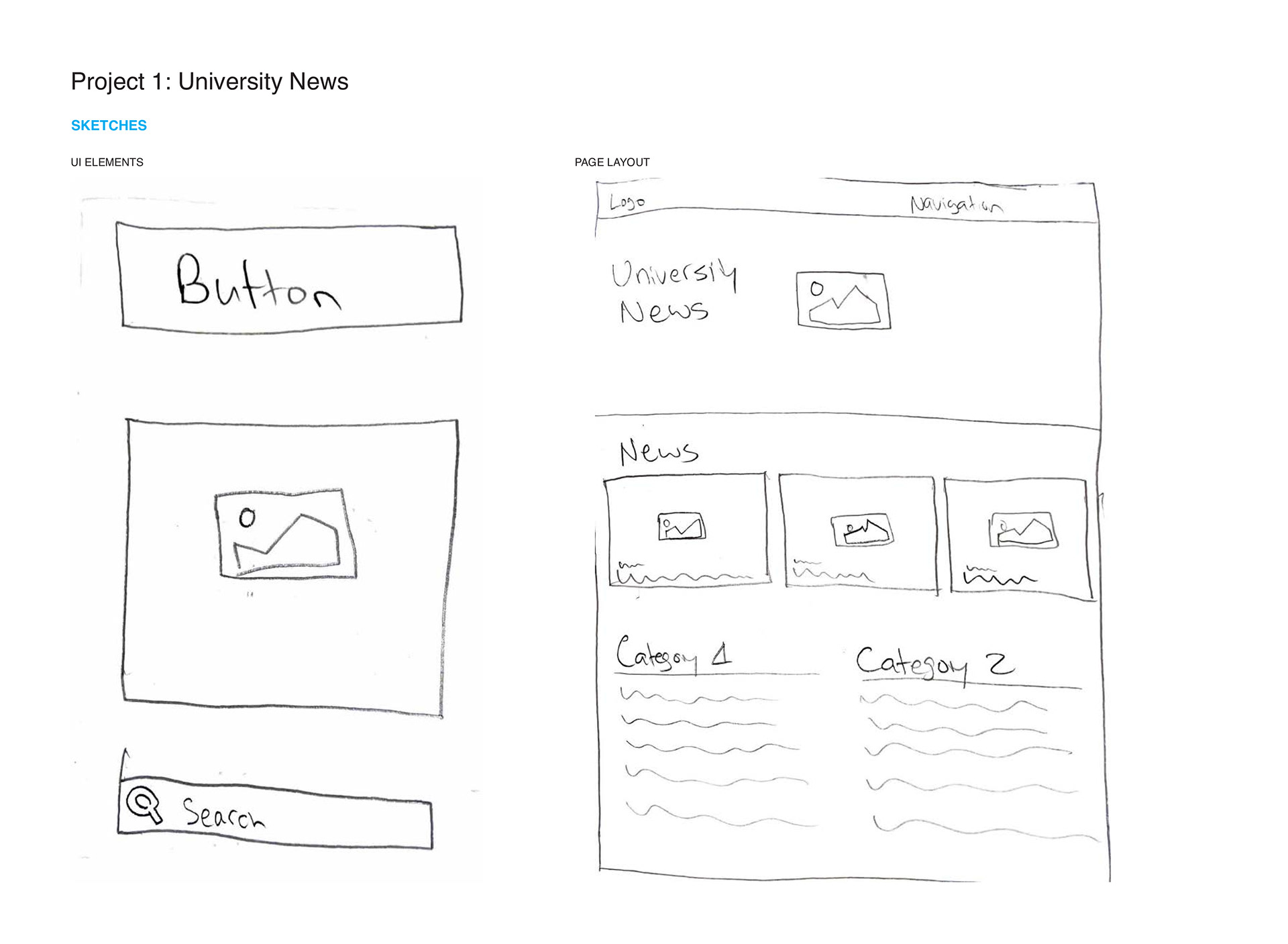

Wireframe


Preliminary Composition Screens
Option 1
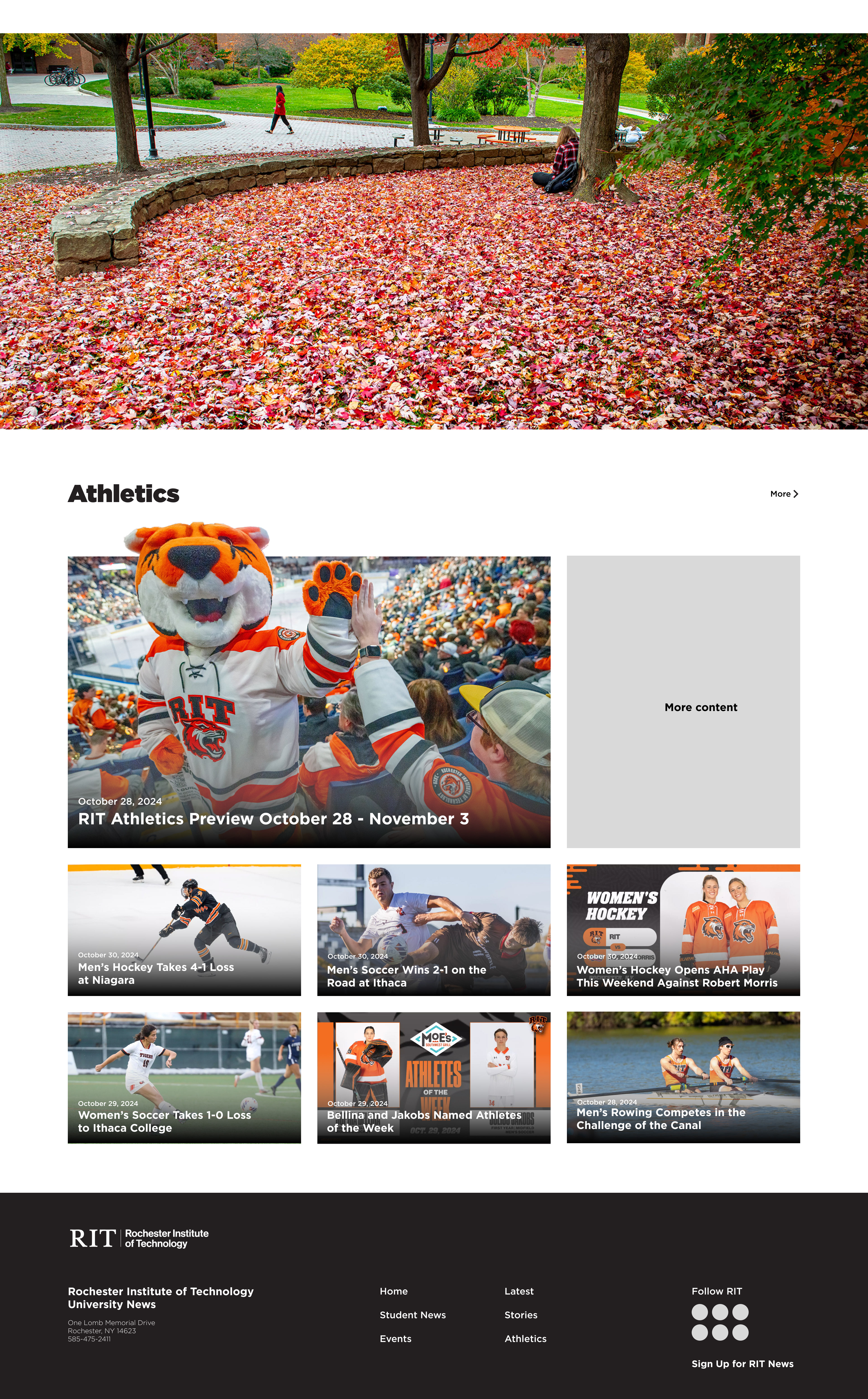
Option 2
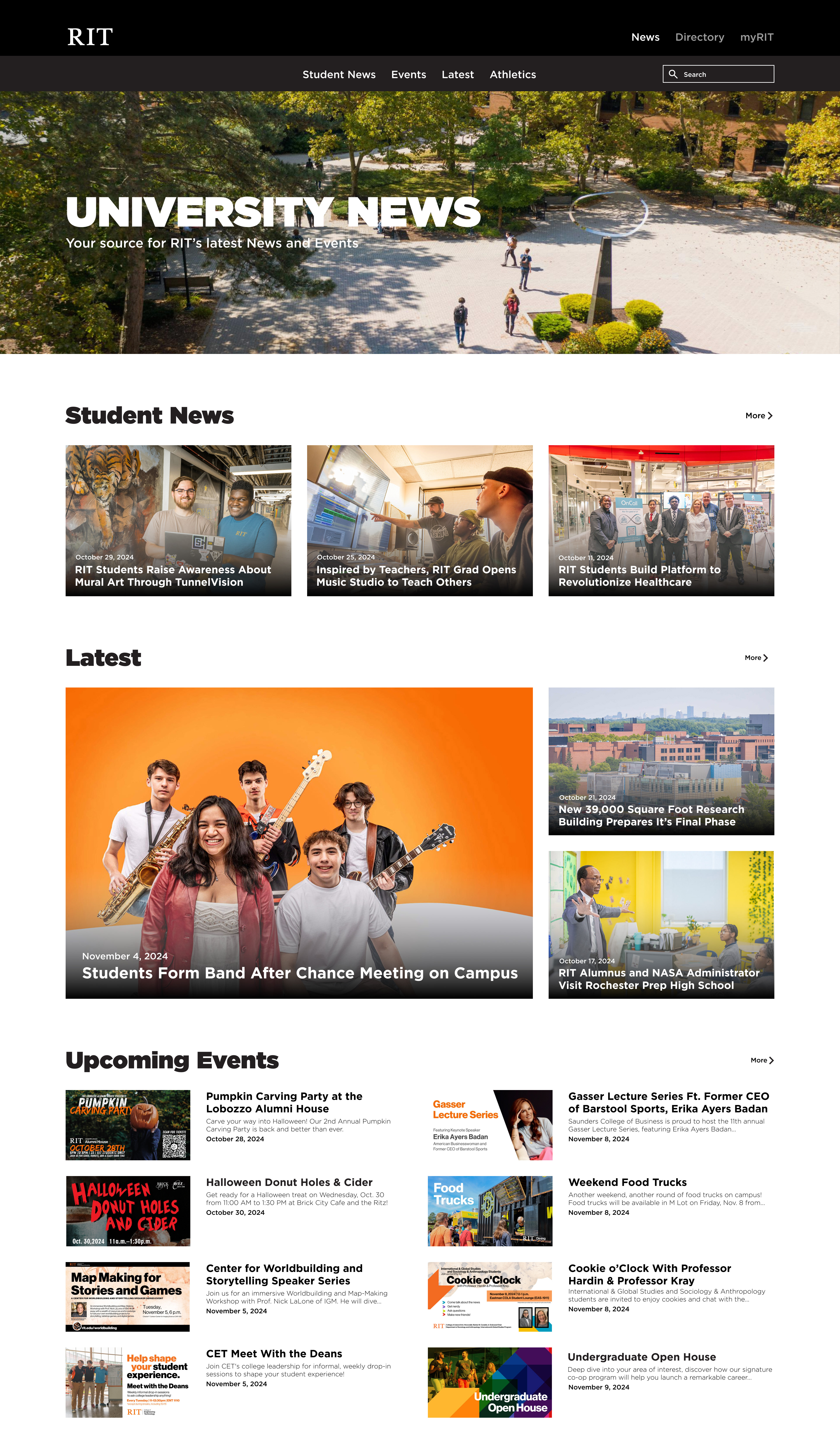
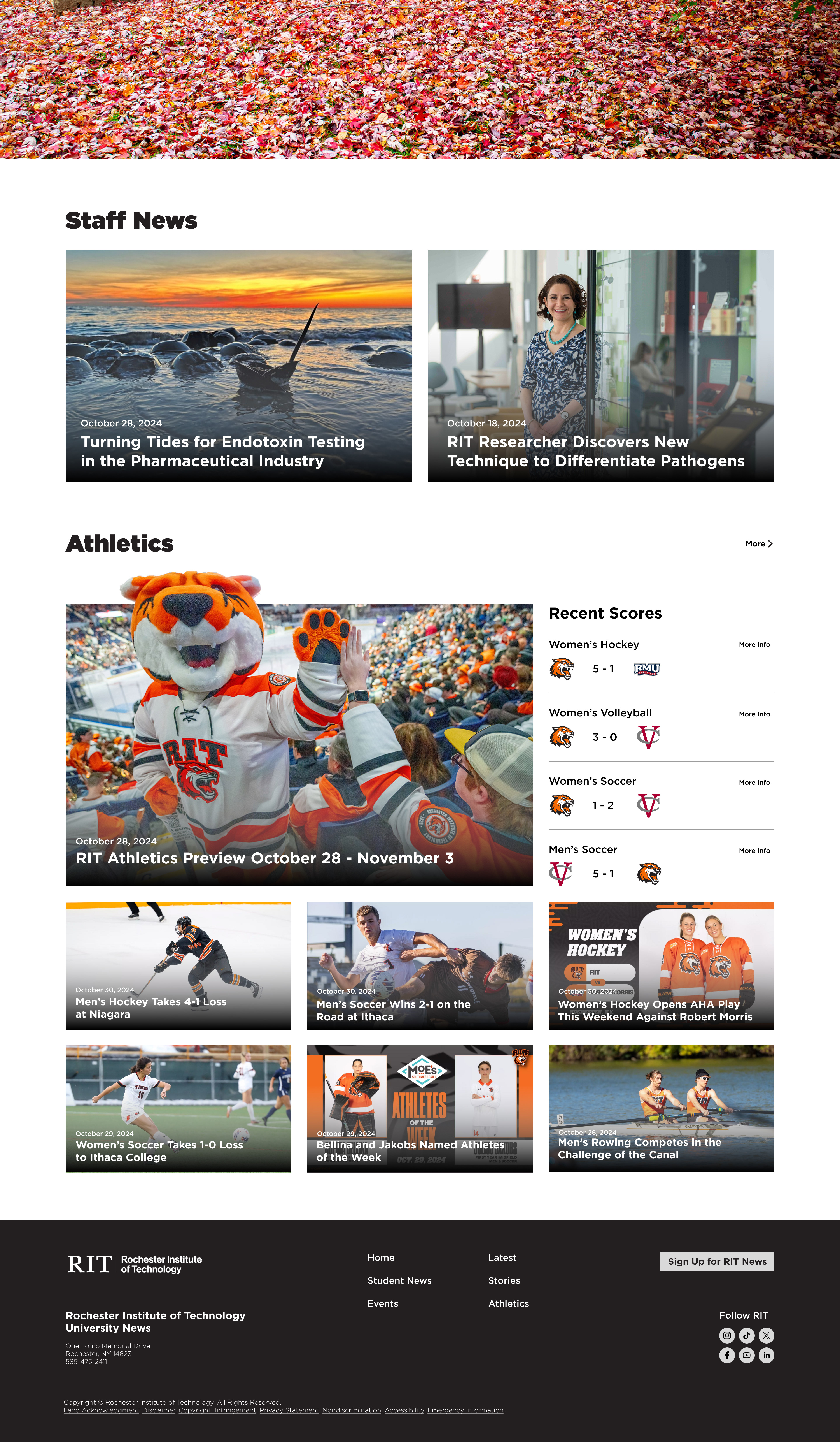
Final Screens
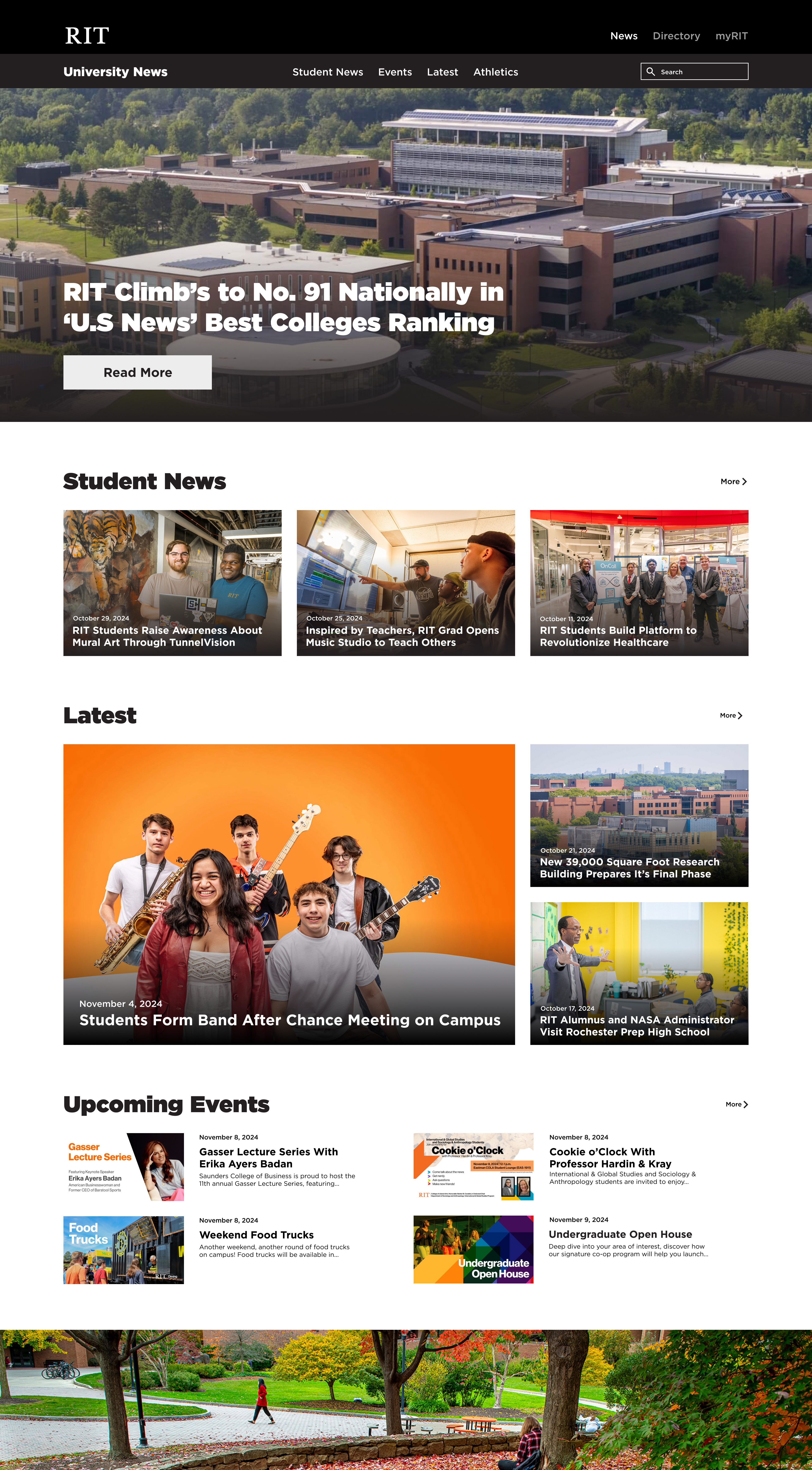
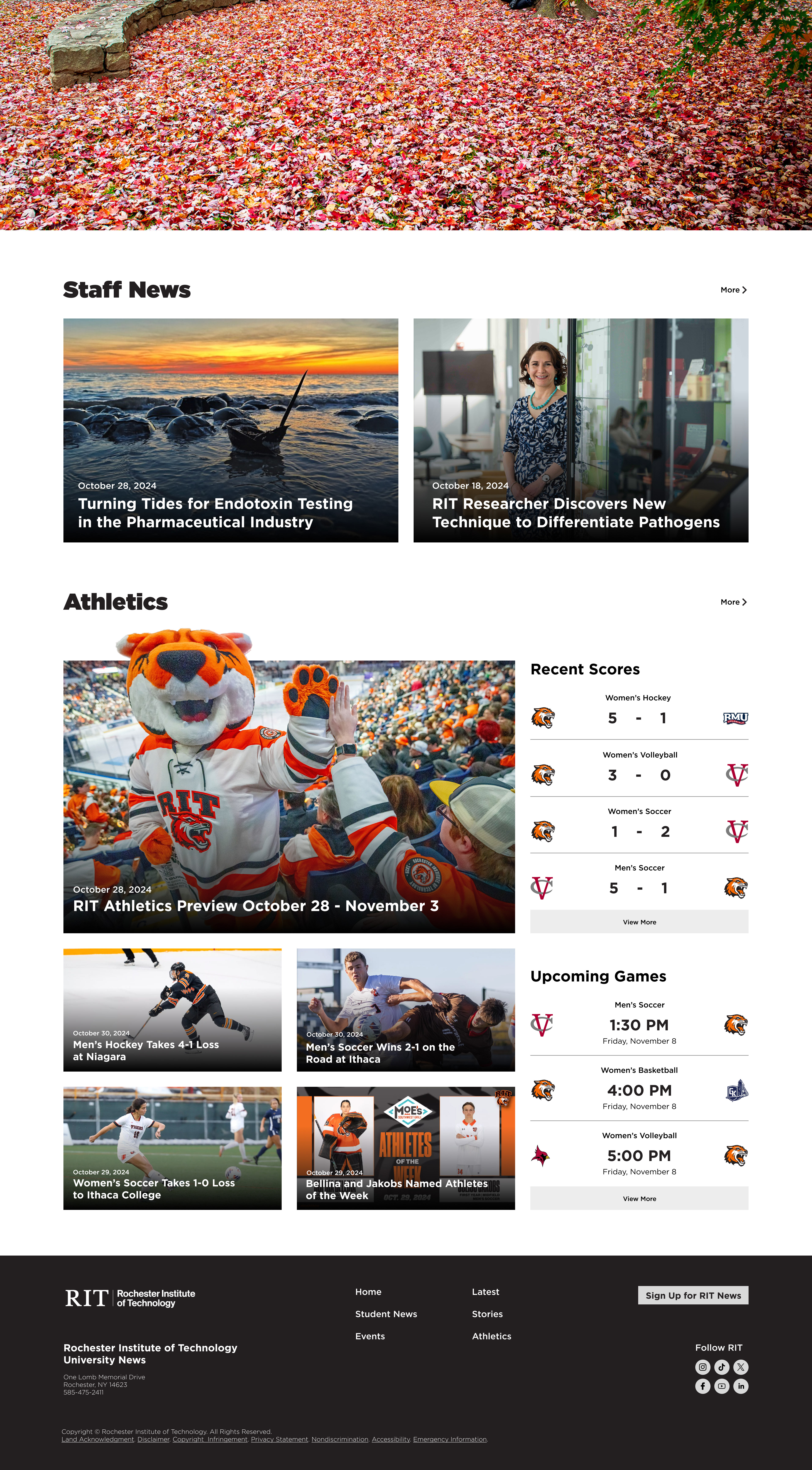
Final Prototype
Takeaways:
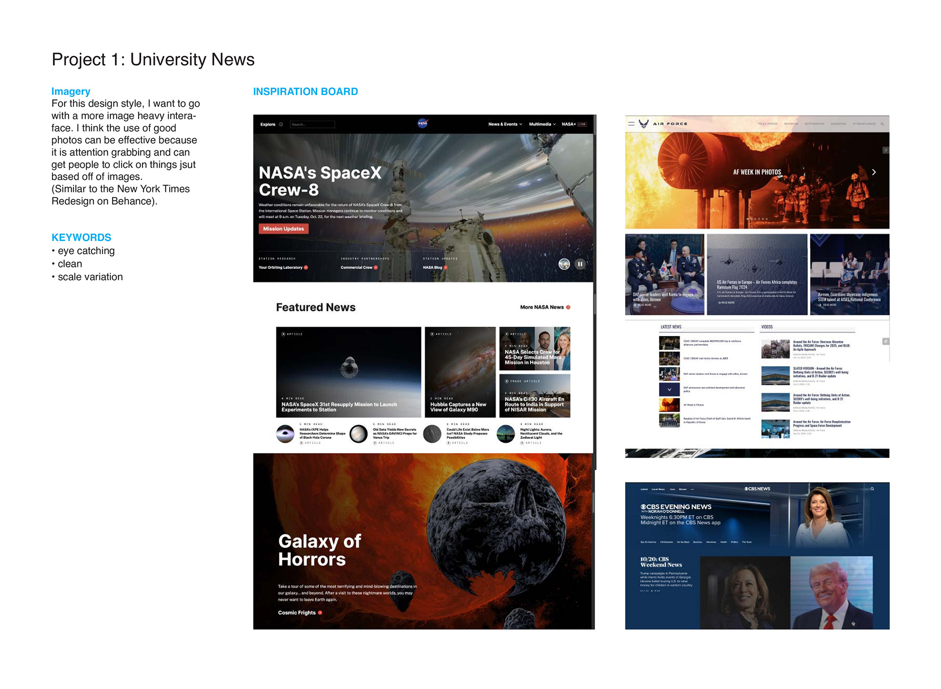
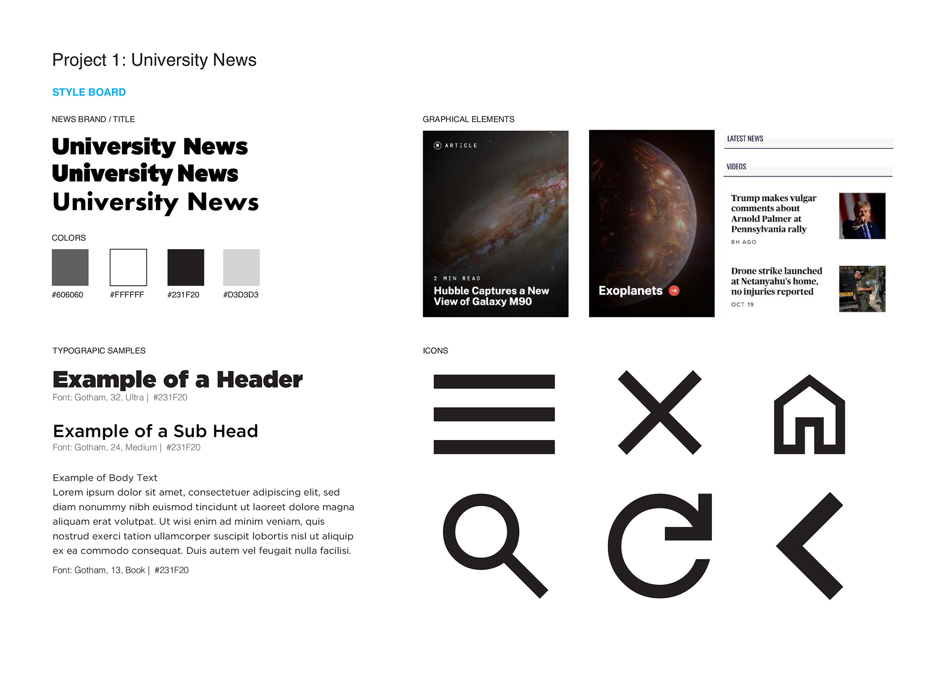
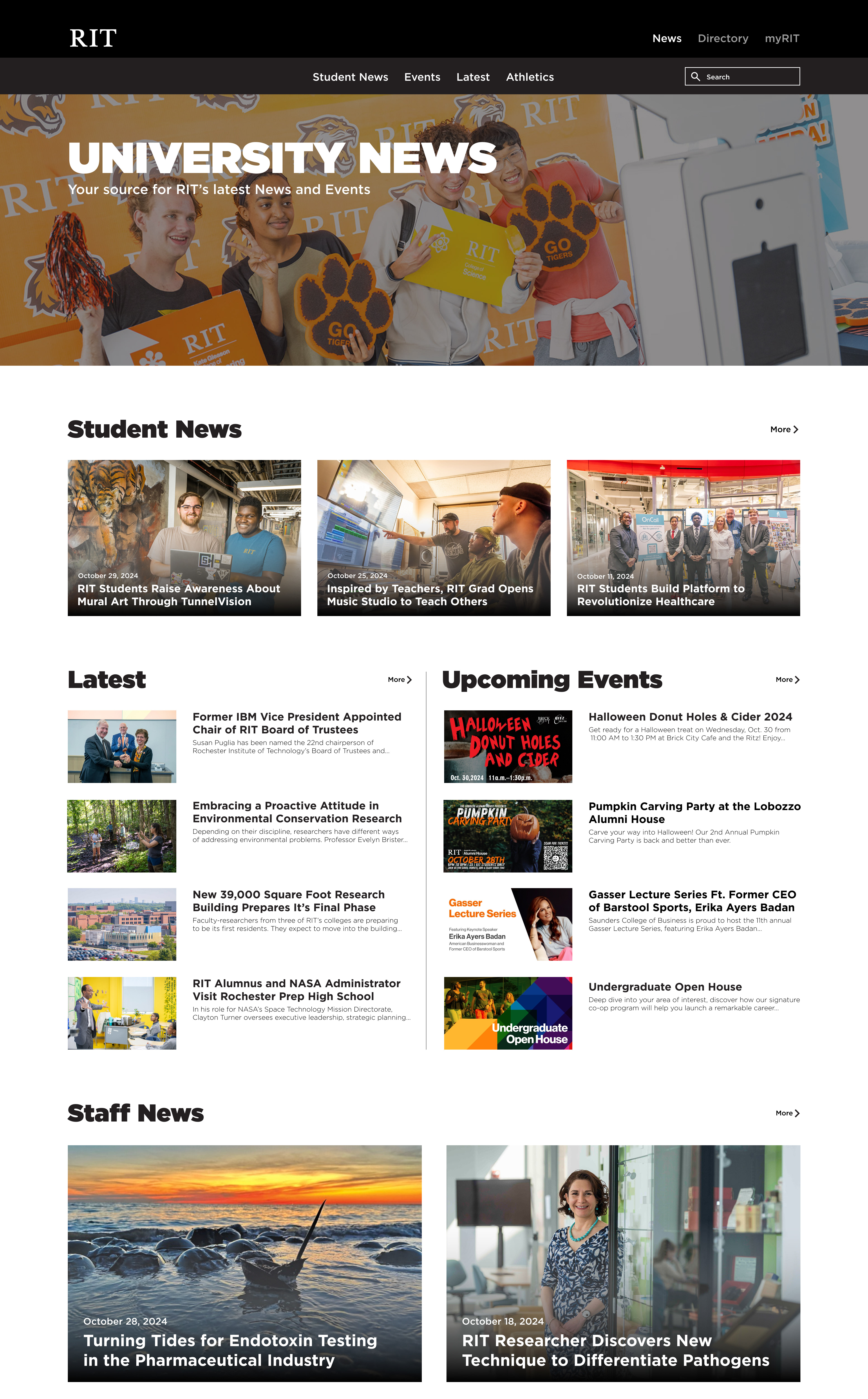
This updated version of the RIT news website is successful in reducing the visual overload, and creates a more digestible interface. A lot of the issues I noticed involved having too much text, too many links, and not featuring desired topics. To fix this, I used a very simple color palette, using only black and white. Since I intended for it to be a photo-heavy site, having too much color would be distracting.
With the imagery being the main focus, I also reduced a lot of the text, giving only brief headers, sub headers, and dates. The content included in my site is another thing that was changed. The content I chose was tailored to what students would like to see based off of a poll by RIT students.
